


WildFloral Responsive Webpage

Project Overview
The product:
WildFloral is a sustainable florist that offers an option to purchase bunches or bundles of flowers to reduce waste. Additionally, they offer a design your own bouquet option to accommodate any budget.
My role:
User Research, Information Architecture, Interaction design, UI design, Prototyping & Testing


The problem:
Due to the limited life of fresh flowers, florists are often faced with wasted flowers and greenery.
The goal:
Design a user friendly website for a florist that offers bunches and bundles of flowers, that would otherwise be thrown out, at a discounted rate.
User Research: Summary
I conducted interviews, which I then turned into empathy maps to better understand the target user and their needs. I discovered that many target users enjoy shopping online for flowers as a fun, relaxing way to send gifts loved ones, or to brighten up their living space. However, many online florist websites are overwhelming with options and confusing. Additionally users generally find florists to be too expensive to shop regularly. This makes it difficult for florists to reduce waste and for users to shop sustainably.
Sustainability
Overwhelming
Budget
Many florists experience high levels of plant waste once flowers are no longer at their freshest.
Most florist bouquets are often priced at higher and not accessible to all budgets.
An abundance of options make it difficult for users to decide on a bouquet.
User Research: Pain points
Persona: Nicola
Problem Statement:
Nicola is a part-time florist who needs to sell flowers that are no longer at their freshest because they usually are thrown out.

Competitive Audit


Starting the Design
Paper Wireframes
Next, I sketched out paper wireframes for each screen in my app, keeping the user pain points about navigation, browsing, and checkout flow in mind.
The home screen paper wireframe variations to the right focus on optimizing the browsing experience for users.
Paper wireframe screen size variation(s)
Because WildFloral’s customers access the site on a variety of different devices, I started to work on designs for additional screen sizes to make sure the site would be fully responsive.


Digital wireframes
Moving from paper to digital wireframes made it easy to understand how the redesign could help address user pain points and improve the user experience.
Prioritizing useful button locations and visual element placement on the home page was a key part of my strategy.

Low-Fidelity Prototype
To create a low-fidelity prototype, I connected all of the screens involved in the primary user flow of adding an item to the cart and checking out.
At this point, I had received feedback on my designs from members of my team about things like placement of buttons and page organization. I made sure to listen to their feedback, and I implemented several suggestions in places that addressed user pain points.
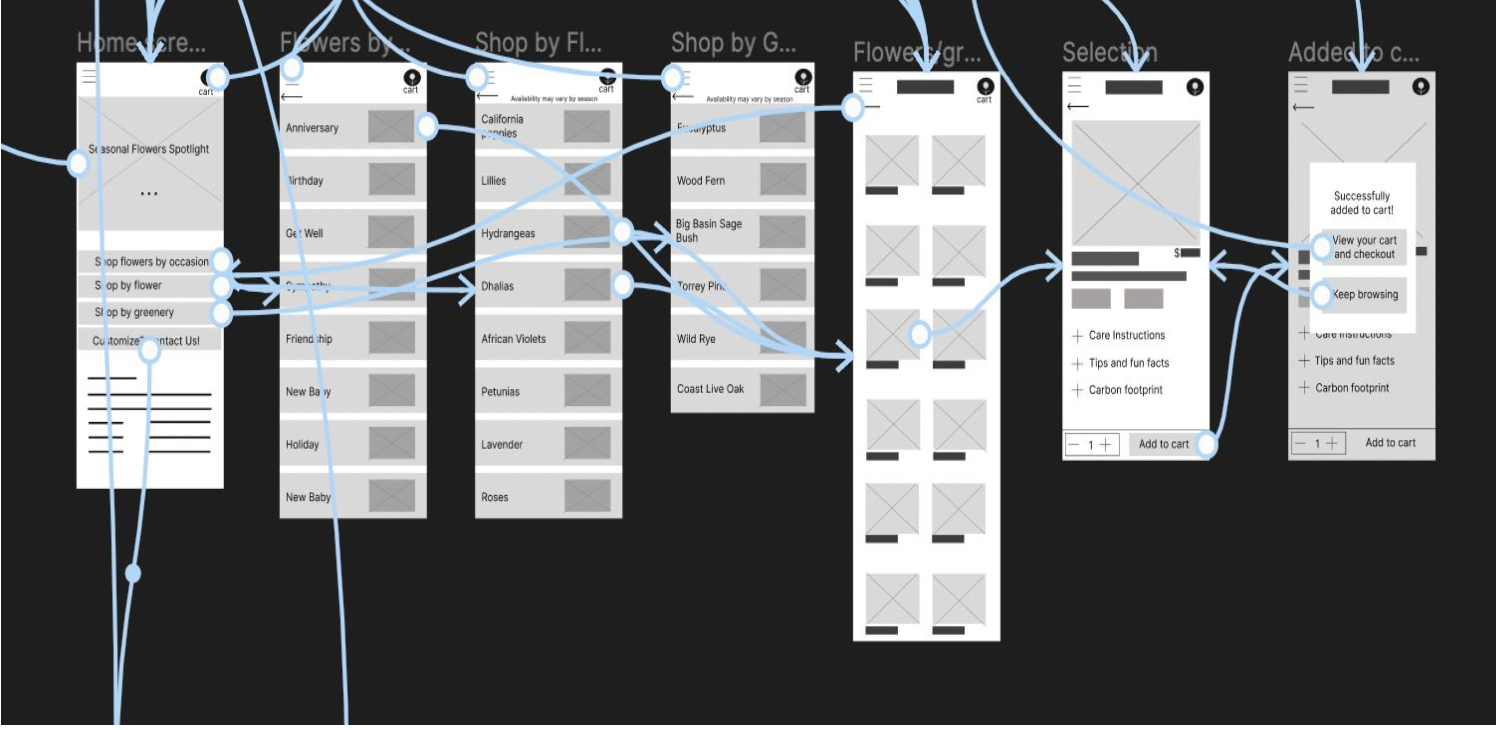
Cart
Blog
Account
Users were confused by the cart popup when viewing their basket.
During the checkout process, there wasn’t a clear way for users to log in to their account to pre-fill previous billing and shipping information.
Users preferred to view information about what is in season rather than the blog on the home screen.
Usability Testing


Usability Findings
Redefining the Design
Mockups
Based on the insights from the usability study, I made changes to improve the site’s home screen. I rearranged the layout and added a carousel for users to easily browse.

Mockups
To improve visual flow of the user’s basket, I removed the cart information to avoid redundancy.

Mockups Original Screen Size

Mockups Screen Size Variations


High-Fidelity Prototype
My hi-fi prototype followed the same user flow as the lo-fi prototype, and included the design changes made after the usability study, as well as several changes suggested by members of my team.
1
3
2
I used headings with different sized text for clear visual hierarchy.
I used landmarks to help users navigate the site, including users who rely on assistive technologies.
I designed the site with alt text available on each page for smooth screen reader access.
Accessibility Considerations
Going Forward
Takeaways
Impact:
Our target users shared that the design was intuitive to navigate through, more engaging with the images, and demonstrated a clear visual hierarchy.
What I learned:
I learned that even a small design change can have a huge impact on the user experience. The most important takeaway for me is to always focus on the real needs of the user when coming up with design ideas and solutions.